
CH 5 Part 2: Graphic Design-Putting It All Together
POSTER DESIGN
Now that you’ve created a personal logo and developed that idea we’re going to take it a bit further and create a personal poster design that incorporates the logo and promotes yourself. You will use your own original photographs and typography in the poster and it should further illustrate your concept from the logo design. You cannot use any photos of yourself though! Find other ways to express your idea. First let’s look at some examples of high quality posters.
A good design has interesting typography, images and bright bold colors with a clear and easy to understand message. Usually you don’t want to use more than 3 fonts on a poster. Look at the interactive posters on the next pages to see more specific examples of high quality design.
A good design has interesting typography, images and bright bold colors with a clear and easy to understand message. Usually you don’t want to use more than 3 fonts on a poster. Look at the interactive posters on the next pages to see more specific examples of high quality design.
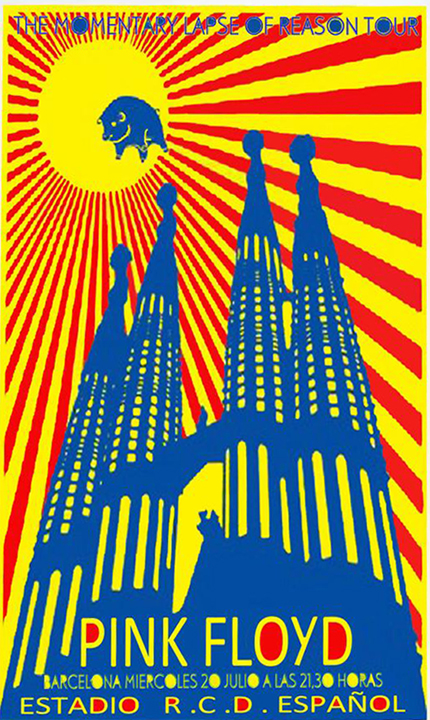
Strong Dynamic Composition-This poster uses strong compositional techniques including, leading lines, dynamic diagonals and rule of thirds.
Bold Colors-This poster uses bold colors that contrast well. The colors also relate to the flag of Barcelona.
Unique Image-This is a photo of La Sagrada Familia in Barcelona, Spain. It is an amazing cathedral designed by Antoni Gaudi. This image has been altered to significantly and turned into a graphic design element that uses bold color and contrast.
Typography-The poster uses interesting typography that relates to the mood of the city and the band playinig there.
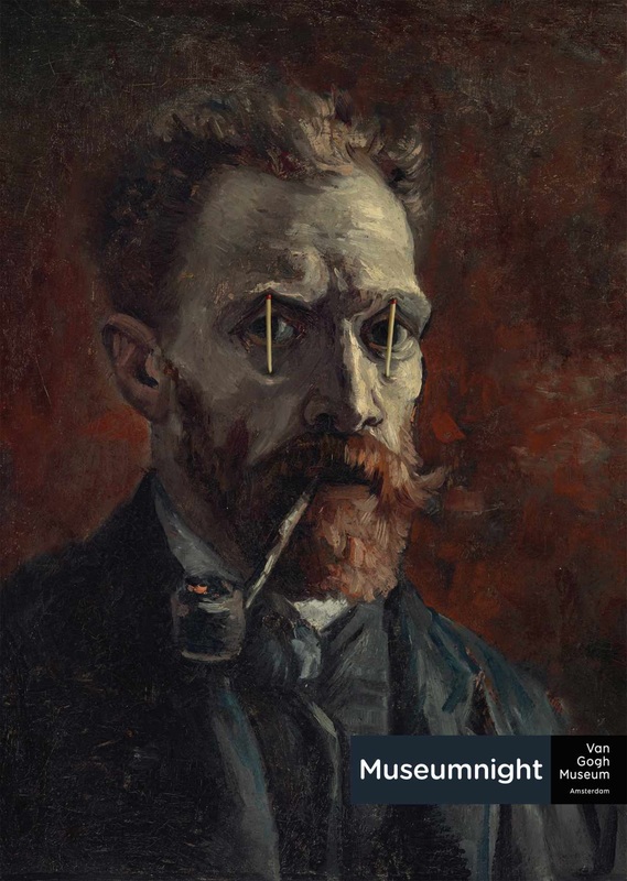
Humor or Cleverness- The image here is a famous Van Gogh painting, but it is altered to add the matchsticks to hold open his eyes for the late night at the museum.
Clear Easy to Read Typography-This poster uses very little type and it takes a moment to get, but once you read the title it all makes sense with the image.
Simplicity Communicates the Idea- Using a unique image and just a few design elements creates a simple and meaningful message that is easy to understand. Sometimes less is more. In design there is a little acronym that some designers use: K.I.S.S. keep it simple stupid or silly!
Your Assignment
Learning Target: Create a poster that communicates who you are. This is not meant to be a portrait project. You will NOT use any photos of yourself, but photos can be used. You will incorporate the personal logo you designed and continue this idea with the poster.
Create 3 thumbnails that plan 3 different overall layouts for your poster design. Is it vertical or horizontal? What compositional techniques will you use? What poster design techniques will you use? Will you use photographs? What will they picture? Will you edit/alter the photos? What app will you use? How will you incorporate your logo? How does the logo concept connect to the poster concept? When you conference with your teacher have your thumbnails for the poster design and be prepared to answer all these questions.
- It SHOULD be about your interests, beliefs, values or possibly what you might want to do as a career.
- Use your choice of the various imaging and drawing apps that we’ve learned to use.
- Your poster should meet the 3 Cs of quality art.
- Create images (photos, drawings) that are bold and interesting and connect to your concept, but that aren’t portraits of you. Consider a symbol that relates to your idea.
- Use images, color, typography, shapes and a bold message. You may want to develop a slogan or catchphrase that helps communicate the message
- Incorporate your personal logo into the poster in some way.
- Remember that with typography you don’t want to use more than 3 fonts in one design.
- Consider using dynamic lines, shapes or diagonals. Use the whole page.
Create 3 thumbnails that plan 3 different overall layouts for your poster design. Is it vertical or horizontal? What compositional techniques will you use? What poster design techniques will you use? Will you use photographs? What will they picture? Will you edit/alter the photos? What app will you use? How will you incorporate your logo? How does the logo concept connect to the poster concept? When you conference with your teacher have your thumbnails for the poster design and be prepared to answer all these questions.
Apps To Use- Free Choice, You Decide
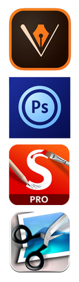
Adobe Illustrator Draw- This is a vector-based drawing app that allows you to draw, shade, render and more. Click here for a tutorial on Illustrator
Adobe Photoshop Touch: This is a great app for editing photographs, but can also be used to design with type, color, shape and images. Click the Adobe Photoshop name to see a tutorial on all the features of Photoshop Touch.
Sketchbook Pro- This is the app we used on our first projects to draw and paint on top of photographs in the selfie assignment. Remember to use layers here.
Photogene- This app is similar to Photoshop and allows you to edit photos including the colors, contrast and more. We used this app on the Selfie unit.
